top of page


Monumentaal, Filmisch, Direct en geëngageerd, dat zijn de pijlers waarop ik mijn ontwerpen maak.
Mijn naam is Roel, en ik ben één van de afstuderend scenografen van lichting 2021.
Mijn doel is verrassende en doeltreffende theatrale werelden te scheppen
en deze een actief onderdeel te laten zijn van een dramaturgische ontwikkeling of de omgeving.
Dit zowel op de theatervloer als daarbuiten, In de fysieke ruimte als de digitale wereld.
Voor mij heeft theater heeft de unieke kracht allerlei kunstvormen en (technische) middelen te combineren.
En deze samen te brengen om belangrijke verhalen en gebeurtenissen vertolken aan een publiek.
Monumental, cinematic, direct and engaged, those are the pillars on which I construct my designs.
My name is Roel, and I'm one of the graduating scenography students from the class of 2021.
My goal is to create surprising and effective theatrical worlds.And let them be an active part of the dramaturgical development or its immediate surrounding.
Whether it is for the stage or the outside world outside, in a physical space or the digital world.
For me Theatre has the unique power to combine all sorts of art and (technical) resources.
And Bring them together to tell important and engaging stories to the audience

Praktijkproject
Praktijkproject - Suicide Sisters

In samenwerking met afstuderend regisseuse Eva van Kleef en productiehuis Het Laagland heb ik het decorontwerp gemaakt voor de voorstelling Suicide Sisters. Deze jeugdvoorstelling is geïnspireerd op het boek The virgin suicides van de Amerikaanse schrijver Jeffrey Eugenides. Suicide Sisters is een coming-of-age verhaal waarin levenslust en de dood lijnrecht tegenover elkaar komen staan.
Bij het maken van deze voorstelling ben ik verantwoordelijk voor het ontwerpen, bouwen en opzetten van het decor en lichtplan.
For the play Suicide Sisters I've made a set and lighting design, in cooperation with graduating director student Eva van Kleef and production house Het Laagland. This youth play is inspired by the book The virgin suicides by american writer Jeffrey Eugenides. Suicide Sisters is a coming of age story in which lust for life and death are being put in perspective.
For thisproject I was responsible for the designing, building and making of the set design and light plan.


S
U
I
C
I
D
E
S
I
S
T
E
R
S
Decor ontwerp / Stage design
Ontwerp proces / Design proces

Suicide Sisters - schetsboek

Suicide Sisters - schetsboek

Suicide Sisters - schetsboek
Suicide Sisters - schetsboek
1/7

Suicide Sisters - inspiratie

Suicide Sisters - inspiratie

Suicide Sisters - inspiratie
Suicide Sisters - inspiratie
1/9
De voorstelling Suicide Sisters gaat over 3 jongens die hun middelbareschooltijd herleven en met name de zusjes Lisbon, zij zaten op dezelfde school als de jongens. Allen waren zij smoorverliefd op de zussen die uiteindelijk allemaal zelfmoord zullen plegen.
Voor het decor ben ik vooral op zoek gegaan naar een omgeving die erg associatief is met het leven van een groep jongeren maar gelijktijdig niet direct definieerbaar is.
The play Suicide Sisters is about 3 Boys who are reliving their high school years, and their relation to the Lisbon sisters who where at the same school. All three of them were in love with these sisters, unfortunately they all committed suicide.
For the set design I mainly searched for a undefined space where the play would take place. This space would have to be easily associative with the world the characters live in.
Naast het zoeken van inspiratie beelden ben ik vrij snel bezig gegaan met het schetsen van ruimtes en vormen. Hierbij zocht ik vooral naar een omgeving die meerdere associaties met zich meebracht. Ik zocht naar manieren om licht in te zetten om de ruimte in een andere sfeer of context te plaatsen. dit deed ik in eerste instantie in 2D schetsen om deze vervolgens om te zetten in een 3D tekening waarbij ik ook lichten kon plaatsen.
Together with the research, I started drawing some first sketches to get an idea of what the set design could look like. I wanted to create a space that is able to have multiple associations. To achieve this I looked for ways to implement light as a way to change the context and impression of the set. I did this with 2D sketches which were then drawn in 3D programs in which I could also place lights.
Bij het bedenken van het decorontwerp kwam ik er snel achter dat ik licht wil gaan gebruiken om de ruimte te transformeren. Om hiermee te experimenteren ben ik na het maken van mijn schetsen aan de slag gegaan in het 3D tekenprogramma 3Ds max.
Dit programma geeft mij de mogelijkheid om naast het maken van vormen ook te spelen met licht.
Daarnaast geven de renders die ik in dit programma maak een goed beeld van hoe het uiteindelijke theatrale beeld eruit kan zien. Dit helpt enorm in de communicatie met de regisseur, maar ook de kostuumontwerpster. Hierdoor kan zij ook al zien wat het licht doet met de kleuren van de kostuums.
When making my set design I quickly came to the conclusion that I wanted to use light to transform the scenography. I used the 3D drawing programme 3Ds max to experiment with this concept which enabled me to see how light would behave in a space.
The images I can produce with this programme also create a realistic idea of what the set design would eventually look like. This helps al lot when communicating the concept with the director, but also with the costume designer. Because of these images she was able to see what the light would do with the color of the costumes beforehand.

Suicide Sisters - renders

Suicide Sisters - renders

Suicide Sisters - renders
Suicide Sisters - renders
1/11


Suicide Sisters - bouwproces

Suicide Sisters - bouwproces

Suicide Sisters - bouwproces
Suicide Sisters - bouwproces
1/8
Bij deze productie was ik volledig verantwoordelijk voor alles wat met decor en licht te maken had. Dit betekende dat ik het hele decor opzette van schets tot bouw, tot aan het lichtontwerp in de schouwburg.
Voor het decor was vooral het materiaal van belang, hiervoor deed ik uitgebreid onderzoek. Voor de wanden zocht ik naar een materiaal dat makkelijk aangetast kan worden en de look heeft van een tegelmuur. Het moest daarom makkelijk afwasbaar zijn, en daarnaast niet te zwaar omdat het decor ook moet rondreizen.
uiteindelijk kwam ik uit op hardboardplaten met tegelmotief, deze zijn licht van gewicht en daarmee ook makkelijk vervoerbaar.
For this production I took full responsibility for everything that was related to set and light. I hence did the set design, set construction and the lightplan in the theatre itself.
For the set itself I focused a lot on searching for the right materials. For the white walls I looked for a material that could be drawn upon and have the specific tile look I was going for. It had to be easily washable but also not too heavy so it could go on tour. I ended up using hardboards with a tile texture. This material is lightweight and with that easily movable.


Het tweede onderdeel van het decor was een groot lichtobject in de vorm van een roze plastic gordrijn. Voor dit materiaal liet ik ook meerdere stalen leveren om te bepalen welk materiaal het juiste effect gaf in combinatie met licht.
Tijdens het proces deelde ik constant mijn progressie met de regisseuse en kostuumontwerpster. Hierbij waren duidelijke tekeningen en communicatie cruciaal.
Door constant te blijven communiceren raakten we elkaar niet los in het proces terwijl we elkaar wel de vrijheid gaven autonoom te werken.
The Second part of the set design is a large light object in the shape of a pink plastic curtain. The main criteria was the way the material would react to light, to figure this out I did research into different materials and ordered different samples to see what would work.
During the desing process, I constantly communicated my progress with the director and the costume designer clear readable drawings and clear communication where crucial in this process. Because of this constant and clear communication we never lost track of the end result which allowed us to work autonomously form each other towards the end.
Vorm onderzoek
eerste schetsen
Bouw proces
Othello
Ontwerpproject - Othello

Het welbekende stuk van William Shakespeare Othello was het gekozen stuk voor dit afstudeerontwerp. Bij het lezen van de toneeltekst ben ik vrijwel direct linken gaan leggen naar hedendaagse maatschappelijke vraagstukken. vanuit hier ontstond het concept Othello & complotdenkers. In dit concept leg ik het stuk Othello naast complottheorieën als Q-anon.
Hiernaast ben ik ook gaan kijken naar de manier hoe media de maatschappij kan beïnvloeden en onze perceptie naar andere mensen kan vormen. Dit voorstellingsconcept is vormgegeven voor het Schauspielhaus Bonn.
The well known play Othello by William shakespeare was the play chosen for the graduation stage design project. When reading the play I immediatly started to make connections to contemporary events. From this, my concept called Othello & conspiracy theorists was born. In this concept I'm comparing the play Othello with conspiracy theories like Q-anon.I also started researching the way media can influence society and change our perception of certain people. This stage design was designed for the Schauspielhaus Bonn.


OTHE
L
LO
Decor ontwerp / Stage design
Eind visuals
Onderzoek / Research

Mijn startpunt voor dit concept Othello en complotdenkers, begon bij een artikel gepubliceerd door De Volkskrant (Q-Anon > 03-07-2020). Het artikel gaat in op de van oorsprong Amerikaanse complottheorie Q-Anon. Aanhangers van de complot theorie geloven dat de democratische partij en andere gelieerde elite samenspannen om samen de wereldmacht te behouden. Ten tijde van dit ontwerp proces was
Donald Trump nog aan de macht in de VS en waren er ook de gekste theorieën rond de Covid-19 pandemie.
kortom, genoeg redenen om dit onderwerp een grote rol te geven binnen mijn concept voor deze voorstelling.
Maar waar ligt dan de link met complotdenkers en het door Shakespeare geschreven theaterstuk?
Voor mij lag deze link voornamelijk in de manier waarop Jago mensen om zich heen weet te bespelen en naar zijn eigen hand weet te zetten door middel van leugens. De manier waarop hij omgaat met de waarheid is erg te vergelijken met de manier hoe complottheorieën leugens verspreiden en mensen aanspoort tot actie over te gaan. Dit soort theorieën bestaan weliswaar alleen op het internet, maar het wordt gevaarlijk als dit soort leugens mensen aansporen tot geweld, de bestorming van het Kapitool in Washington begin 2021 is hier een schoolvoorbeeld van.
My first ideas for the concept sparked when reading an article written in De Volkskrant (published on
03-07-2020). The article introduces the origins of the American conspiracy theory Q-anon. Its supporters believe that the democratic party and its elite allies conspire together to maintain world domination. At the time of my design process, Donald Trump was still president of the US and there were also absurd theories about the Covid-19 pandemic going around.Hence, there were enough reasons to give this subject a prominent role in my concept for this theatre play.
But then where is the link with conspiracy theorists and the play written by Shakespeare?
For me the connection was very prominently found with the way Jago Finds a way to influence the people around him with the use of lies. this can be compared to the way conspiracy theories are spreading lies to manipulate people and make them act accordingly . Although these kind of conspiracies only exist online, they becometruly dangerous when they lead people to commit acts of violence, the storming of the Capitol in Washington at the start of 2021 is a prime example of this.
.png)

Naast complottheorieën wil ik ook focussen op de manier waarop Media onze perceptie kan veranderen, en dan specifiek onze perceptie op mensen. Waar Jago media gebruikt als een wapen om te krijgen wat hij wil, kan media ook slachtoffers maken. Momenteel leven we in een tijd waarbij iedereen zijn stem kan laten horen via sociale media, aan de ene kant is dit positief. Maar deze ontwikkeling heeft ook keerzijdes, zo leven we ook in een tijd waarbij dagelijks mensen door middel van social media vernederd en aangevallen worden.
De manier waarop deze mensen online aangevallen worden is voor mij erg te linken aan de manier waarop Othello langzaam zijn mentale staat en aanzien verliest door de leugens die door Jago verspreid worden.
Ik vond ook een goede vergelijking met de manier waarop minister Grapperhaus werd aangevallen in de media door een foto van hem op een bruiloft waar hij de Corona regels van destijds overtrad.
Op sociale media werd deze toch redelijk kleine fout vrijwel direct groot uitgemeten en werd de geloofwaardigheid van de minister in twijfel getrokken.
Besides conspiracy theories I also want to focus on the way media can change our perception, specifically our perception of other people. Jago, uses media as a weapon to get what he wants. Yet this also means his actions will lead others to be deceived and harmed. We live in a time where everybody can let their voice be heard through social media, but this development also has a dark side, as people can also easily be humiliated and attacked through the same platforms. The way these people are attacked online is very comparable to the way Ohtello is slowly going insane because of the lies that Jago has been spreading.
I've also found a good comparison to the way Dutch minister Grapperhaus was attacked by the media because of a picture that was taken at a wedding where he violated the corona restrictions. This quite minor mistake was blown up in the media, so much so that people started to doubt his credibility as a minister.

Omdat de voorstelling zich grotendeels afspeelt in Cyprus ben ik ook onderzoek gaan doen naar de tumultueuze geschiedenis van deze locatie. Het gelijknamige eiland is namelijk in 1964 verdeeld in 2 delen na een conflict tussen Griekse en Turkse Cyprioten. Door het conflict ligt er tot de dag van vandaag een V.N. bufferzone tussen het Turkse en Griekse deel van het eiland om verder conflict te voorkomen.
In deze bufferzone ligt ook het vliegveld van de hoofdstad Nicosia. Omdat niemand in deze buffer zone mag komen ligt het gebouw er al jaren verlaten bij. Ik raakte geïnspireerd door de architectuur van het verlaten vliegveld, met name de cassetten in de wanden van de zijkant van het gebouw. Ook de oude raampartijen die de enige vorm van licht zijn voor het pand waren een inspiratiebron voor mij.
Because the play is mostly set in the country of Cyprus I decided to research the tumultuous
history of the country. The eponymously called island has been divided in 2 parts since 1964, after a conflict between Greek and Turkish Cypriots. because of this conflict the U.N. has installed a bufferzone to prevent conflict between the two sides.
Within this bufferzone you can also find the old aiport of the capitol Nicosia, which has been abandoned for years. I got inspired by the architecture of the abandoned airport, mainly the cassette wall on the side of the building. I also got inspired by the old windows that create the only source of light inside the building.

Nicosia International Airport

Nicosia International Airport

Nicosia International Airport
Nicosia International Airport
1/5
Ontwerp Proces/ Design Proces


In mijn ontwerp komen een aantal verschillende elementen uit mijn onderzoek samen.
Ten eerste is het gebruik van media cruciaal in het concept, en dan voornamelijk hoe media gebruikt kan worden om mensen te beïnvloeden. In het concept van deze voorstelling laat ik Jago een centrale rol spelen in het gebruik van media.
in het begin van de voorstelling zal hij dan ook voornamelijk digitaal communiceren met behulp van schermen. Maar gedurende de voorstelling zal hij zich ook steeds meer in de fysieke wereld begeven. Oftewel, de acties die hij verricht gedurende de voorstelling gaan van de digitale naar de echte wereld.
There are several different elements from my research that come together in my stage design.
Firstly, the use of media is crucial for the concept especially the way media can be used to influence other people. Jago will play a central role in the use of these media.
At the start of the play he will mostly communicate with others through the use of screens, but along the way he will be increasingly present in the real world. The things he does and the way he influences others will undergo a transition from the digital to the real world.


De volgende stap is het vertalen van het concept naar een fysiek decor.
Omdat media een zo centrale rol speelt in mijn concept streef ik er vooral naar een wereld te creëren die ergens tussen digitaal en realiteit in zit. Dit betekend in dit geval dat een groot deel van het decor uit 2 grote wanden met op iedere wand 36 LED Schermen. Deze worden gebruikt om daadwerkelijk beeld te projecteren, maar ook als lichtbron. Hierdoor kunnen delen van het decor "aan en uit" gezet worden. ook geeft het de mogelijkheid om harde silhouetten te creëren om zo personages als Jago te verhullen.
De schermen dienen als een middel voor Jago om te gebruikt om mensen te beïnvloeden, maar zij verbeelden ook de bombarie waarmee nieuws en media op ons af komen.
bijvoorbeeld in de scene waar de Turken Cyprus dreigen aan te vallen zullen de schermen tientallen nieuwsverslagen tonen.

The next step is translating my concept to a physical set design.
Due to the role media plays in my concept, my goal is to create a world that is in between digital and reality. As a result a large part of my set design exists out of 2 large walls with on each wall 36 LED screens. These will be used to show actual images, but will also be used as a light source. This way parts of the set can be turned "on or off". It also gives the possibility to make the actors appear as silhouettes on stage, which could be beneficial to people like Jago.
The screens serve as a tool for Jago to influence people, but they also depict the way news and media come at us nowadays. For example in the scene where the Turks threaten to attack Cyprus, then they will show a disorganized gathering of news.

De uitstraling van het decor is erg geïnspireerd door de architectuur van het verlaten vliegveld van Nicosia. vooral de cassettewand aan de zijkant van het gebouw zijn leidend geweest voor mijn ontwerp.
Daarnaast beweegt het decor mee met de dramaturgische ontwikkeling van de voorstelling. De twee wanden zijn namelijk ook verplaatsbaar en worden gedurende de voorstelling in verschillende posities neergezet. In het tweede deel van de voorstelling word de achterkant van deze wanden steeds verder zichtbaar, hierdoor word de bekabeling en de constructie onthuld
De systemen achter de wereld die gecreëerd is, word daarmee langzaam onthuld. de wereld van Othello brokkelt langzaam af terwijl Jago zijn digitale façade langzaam laat vallen.


As previously mentioned the design is heavily inspired by the architecture of the abandoned airport of Nicosia.
Additionally, the set itself also making a dramaturgical development during the play.
The two walls are moveable and will be put into different positions during the theatre play.
During the second part, the backside will progressively become visible to the audience. This way the cables and construction of the walls and the screens can be observed.
The systems behind the world that is being created are then revealed bit by bit to the audience. Othello's world slowly crumbles as Jago drops his digital façade.


Procesboek/Procesbook
Kijk vooral door mijn procesboek voor dit project voor een meer gedetailleerde omschrijving en verdieping in het onderwerp van het concept.
Don't hesitate to look through my procesbook for this project for a more detailed description and analasys of the subjects in the concept.
Installatie - A cure for weltschmerz
Installatie

For the installation project A cure for weltschmerz I dived into the world of climate change and the roll that large multi-nationals play in this problem. It appeared to me that science, protestst and hard facts are no match against large corportations like Shell, BP and Vattenfall. Especially when they spent Millions on misleading marketing campaigns that give a much better image of the company.
Trying to look for a way to directly fight this only made me more cynical and hopeless, so then i thought, "if you can't beat them, join them". I started to search for a way to expose the marketing tactics of these large polluters and with this, also show the absurdity of these tactics.
From this, the fictional brand Sorgenfrei was born.
Voor het installatieproject A cure for weltschmerz deed ik een onderzoek naar de gevolgen van klimaatverandering en de rol die grote bedrijven hierin spelen. Wat ik vooral zag is dat de wetenschap, protesten en harde feiten niets lijken uit te halen tegen grote multinationals als Shell, BP en Vattenfall. Vooral niet wanneer deze bedrijven miljoenen besteden aan het maken van misleidende reclames die het bedrijf veel beter laten voordoen dan dat ze daadwerkelijk zijn.
Het bevechten van dit gegeven maakte mij alleen maar cynischer en hopelozer, toen dacht ik,
"if I can't beat them, join them". Daarop ben ik op zoek gegaan naar een manier waarop ik de marketing tactieken van de grote vervuilers kan openbaren, en daarmee ook kan laten zien hoe absurd deze tactieken in de praktijk zijn.
Hierop bedacht ik een fictief bedrijf genaamd, Sorgenfrei.

A
C
U
RE
FO R
WE
L
T
S
CHMERZ
Our Mission
>
Our Brand
>
Our Inspiration
>
De installatie / The installation
Our Promotion
>


Pop-Up stand
>


Onderzoek / Research
A cure for weltschmerz begon bij het een eigen gevoel van ongemak rond de klimaatcrisis.
Ikzelf en vele andere maken zich regelmatig zorgen om de staat van het klimaat en de gevolgen die hier in de toekomst aan verbonden zijn. Wat mij opvalt is dat er aan de ene kant veel zorgen zijn en men vaak uitgaat van een negatieve uitkomst terwijl veel reclames en marketing ons juist doen geloven dat alles opgelost gaat worden, vaak door middel van een nieuwe technologie of een wonder oplossing.
Hierop ben ik dieper ingedoken op het begrip "greenwashing".
Greenwashing is een benaming die gebruikt word wanneer bedrijven of instanties kleine duurzame investeringen maken en deze vervolgens groot uitmeten door middel van marketing.
Hierdoor lijkt het voor de buitenwereld alsof zij zich inzetten voor duurzaamheid terwijl dit in realiteit maar een klein onderdeel is van wat het bedrijf daadwerkelijk doet.

A cure for weltschmerz started with my own feeling of discomfort surrounding the climate crisis. Myself and many others are regularly are worried about the state of the planet’s climate and the effects this will have on our lives. What occurs to me is that on one side there is a lot of worrying news but on the other side a lot of commercials are showing us that everything will be alright. this mostly through a wonder solution or technological progress.
Because of this I dived deeper in the world of "Greenwashing".
This is when a corporation or organisation uses small renewable investments but makes them appear larger in their marketing campaigns. This results in a “greener” image of the corporation than is truly the case, and emphasises only a small portion of their actions, hiding their overall environmentally unfriendly behaviour.

Wat ook opvalt is dat een aantal van bedrijven met hun marketing juist specifiek inspeelt op het angst gevoel dat men bij de klimaatcrisis ervaart. Specifiek op wat voor invloed klimaatverandering gaat hebben op de komende generaties. Je ziet dan ook bij veel reclames het gebruik van jongeren of kinderen. Zo gebruikt het bedrijf Vattenfall (voorheen Nuon) in een groot deel van de marketing campagne kinderen, van posters tot kind acteurs. En ook Shell is er niet vies van bewust kinderen te gebruiken in het verkopen van een groen imago.
Wat hier het cru aan is is dat dit waarschijnlijk de generatie gaat zijn die het meest zal leiden onder de gevolgen van klimaatverandering. daarom heeft het iets heel absurds dat juist zij een grote rol spelen in de marketing campagnes van grote multinationals. Het zou het zelfde zijn als het Nederlands elftal dat voor Duitsland juicht tijdens het WK voetbal.
In addition to this, corporations specifically use the feeling of dread that people feel around the climate crisis in their marketing. And more particularlythe way climate change will affect the generations. There are many advertisements that use children or teenagers. For example a large part of Vattenfall's (formally Nuon) marketing campaign is using children and child actors to sell their green image. But also Shell is not afraid to use children to sell their green image.
What feels wrong about this is that this is also the generation that will be the most affected by climate change . That’s why it feels so absurd that they are specifically being used to promote large polluting multinational corporations.
Ontwerp Proces/ Design Proces

Sorgenfrei logo schetsontwerp

Sorgenfrei logo schetsontwerp
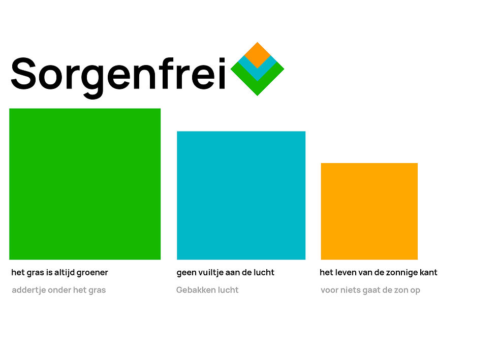
Sorgenfrei logo kleurbetekenis
Sorgenfrei logo schetsontwerp
1/4
Na mijn onderzoek ben ik begonnen met het vormgeven van het fictieve bedrijf Sorgenfrei.
De naam is geïnspireerd op het woord "weltschmerz", ik heb hier de tegenpool van genomen.
De naam wordt gevolgd door de slogan "Don't Worry about it...", deze zin zegt aan de ene kant wat zij doen namelijk het wegnemen van zorgen. Maar het is in deze context ironisch bedoeld omdat we ons wel degelijk zorgen moeten maken. vandaar dook de 3 puntjes achter de slogan.
Hierna ben ik een logo en huisstijl gaan bedenken voor Sorgenfrei. Voor het logo liet ik me vooral leiden door de simplistische logo's van andere bedrijven. Het moest simpel, treffend en herkenbaar zijn, maar vooral aanvoelen als een logo dat echt zou kunnen bestaan.
Voor de huisstijl heb ik me voornamelijk gehouden aan de kleuren uit het logo en deze gecombineerd met dezelfde beeldtaal die grote bedrijven gebruiken. Wat betekend, veel kinderen, beelden van natuur, en gelukkige mensen. Ik zocht hier ook bijpassende oneliners bij die een positief gevoel moeten meegeven, maar dan op een satirische manier.
After my research I started shaping the fictional corporation Sorgenfrei.
The name itself is inspired by the german word "weltschmerz", I took the oppesite german word for it to be the company's name. The name is followed by the slogan "Don't worry about it...", this sentence says exactly what the company does, taking away your worries. But in this context its meant to be ironic because we should definitly be worried. Thats why the slogan is followed by 3 dots.
After this I started to create a logo and a corporate identity for Sorgenfrei. For the logo I took most inspiration from other corporations. The logo had to be simple, striking and recognizable, but most of all had to feel like it could exist in the real world.
I kept the colors from the logo for the corporate identity and combined these with the same kind of images that large corporations use. So that means lost of children, pictures of nature, and happy people. With these images I've thought of some fitting onelines that are meant to give people a positive feeling, but then in a satiric way.
Alle elementen van A Cure for weltschmerz komen uiteindelijk samen in 3 promotiefilmpjes van het fictieve bedrijf Sorgenfrei. Ieder filmpje licht een onderdeel uit van de verschillende marketing strategieën die dagelijks toegepast worden bij greenwashing. Het idee is om met deze filmpjes vooral onverbloemd te zeggen wat Sorgenfrei wil bereiken en hoe zij dit doen.
Bij het maken van de reclamefilms ben ik vooral bezig geweest de elementen die vaak gebruikt worden uit te vergroten of te benadrukken. Zo loopt er op de achtergrond een cliché matig muziekje dat vooral blijft hangen in de gedachten van mensen. In de beeldtaal heb ik vooral gezocht naar stock afbeeldingen die gebruikt worden in het bedrijfsleven en deze in de context van Sorgenfrei geplaatst.
De stem op de achtergrond is bewust een computer gegenereerde stem, dit om juist de menselijkheid uit de boodschap te halen en deze te vervreemden.
All the element of A cure for weltschmerz are combined in 3 promotion videos of the fictional Sorgenfrei corporation. Every video highlights a marketing trick thats used when companies are greenwashing. The idea is to use the video's to straightforwardly say what Sorgenfrei does and how the achieve it.
When making the commercials I have been working on amplifying and amphisize the marketing tactics that are being used. For example, in the background of the video plays a chliché song that is meant to stick in your head. The images that I chose are mostly stock images that are being used in the corporate world, but now have been placed in the Sorgenfrei context
The voice over is deliberatly computer generated one, this because it it makes the message come over less human and in this way enstranges the message.


A Cure for Weltschmerz Schets

A Cure for Weltschmerz Schets

Sorgenfrei Pop up
A Cure for Weltschmerz Schets
1/10
eerste schetsen/ aantekeningen
Om de installatie compleet te maken heb ik gezocht naar een manier om dit fictieve bedrijf in de fysieke ruimte te plaatsen. Het doel was vooral om Sorgenfrei te promoten als een bedrijf dat daadwerkelijk bestaat in de echte wereld. Waar ik op uit ben gekomen is een pop-up promotie ruimte.
Het idee van de vorm is dat men nieuwsgierig gemaakt word naar wat er binnen afspeelt, als het ware worden zij naar binnen gelokt. Dit doormiddel van het geluid van de video die afgespeeld wordt. Wanneer ze de ruimte binnenlopen loopt deze vrijwel direct dood tegen het scherm met Sorgenfrei commmercials.
Een ander belangrijk aspect is dat de zichtbaarheid van het merk door middel van deze installatie vergroot wordt. om dit te bereiken liggen er buttons met het logo om mee te nemen. Door mensen iets gratis te geven promoten ze onbewust Sorgenfrei, wat er toe leidt dat meer mensen zich aangetrokken voelen de installatie in te lopen.
To complete the installation I started to look for a way to place my fictional company in a physical space. The aim was to promote Sorgenfrei as a real life brand. To achieve this I created a promotional pop up space.
The shape of the space is aimed to make people curious to what is going on inside of it. The sound of the video attracts people but when they enter they will be confronted with a dead end and a screen with the Sorgenfrei commercials.
Another important aspect is that the visibility of the brand will be increased because of the installation. There is a give away box filled with buttons that people can take with them. By giving people this for free they will unknowingly make more people curious about what the brand is and attract more people to walk into the installation.
Procesboek/Procesbook
Kijk vooral door mijn procesboek voor dit project voor een meer gedetailleerde omschrijving en verdieping in het onderwerp van het concept.
Don't hesitate to look through my procesbook for this project for a more detailed description and analasys of the subjects in the concept.
Scriptie
Scriptie
SCR
I
PT
I
E
bottom of page